Best Paint Colors for Low-Light Rooms
Best Paint Colors for Low-Light Rooms
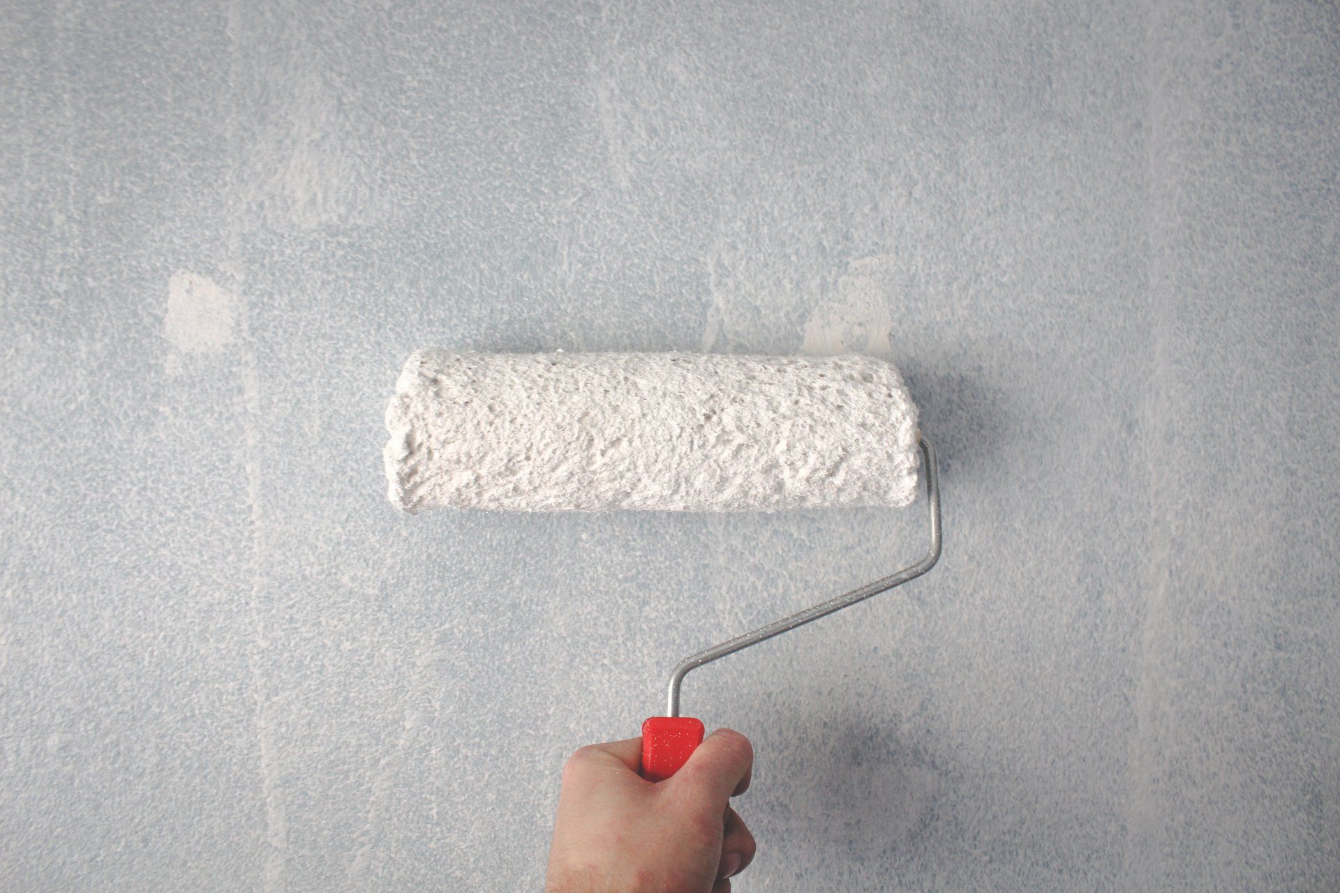
When it comes to paint colors for windows or those that lack natural light, many go for a clean white. While it is tempting to make a room appear brighter by using bright colors, they can be a negative impact. In reality, many of the most effective paint shades for rooms with low light levels lean toward the warmer, not vibrant.
Unsure of what color would be the right one for you? Allow us to help you select the best colors to paint rooms with no sunlight!
Rooms that have low natural light are more vulnerable to gray and shadow tones that create cool colors, which can make the space appear dark. This could make a hallway, or north-facing space, appear dull, gray, and drab. Brighten these spaces by using these paint colors that work well in rooms with very little natural light
Agreeable Grey (SW7029)
- If you're planning to go for cool colors for your room with no windows, make it more appealing by adding some warm undertones, like Agreeable Grey. The beige undercurrents soften the starkness of grey and will work well in a larger areas like bedrooms. Consider the satin or matte finish for spaces that get a lot of traffic. Also, you can enhance the atmosphere of your space with bright accessories and textiles.
Lite Lavender (SW6554)
- Relying again on a medium tone, augmented by warmer undertones, this hint of lavender provides a relaxing feel. The best choice is satin gloss or eggshell; the color is ideal for a relaxing and communal dining area. It is versatile and welcoming. It can be enhanced by combining black, white, and grey furniture, or made more casual with bright violet or blue combinations.
Wheat Penny (SW7705)
- This warm and deep tone is bolder and works perfectly for a space that is cozy. Think about this color with an eggshell-like finish for the intimate spaces of the breakfast area. Make this color more even with subtle accents, such as the white trimming, patterns fabrics, and the carpet's lightness.
Golden Plumeria (SW9019)
- Although not suitable for all, a well-placed light yellow shade like Golden Plumeria can inject some joy into an otherwise dull space. Take this as a shade of light to your kitchen, which is a semi-gloss or high-gloss to ensure durability. With a classic style, match this shade with white wooden cabinets and natural wood accents.
Expressive Plum (SW6271)
- The dark tone has an unsettling look and will create a relaxing atmosphere. Apply it to the cozy vibes of the TV lounge with eggshell gloss. Smooth out the soothing hue by using warm metals like copper, brass, and bronze, and gallery walls of art.
Rainwashed (SW6211)
- The cooler shade with hints of green and blue underneath can bring life to a smaller space. Use this aqua-tinted tone as a solid semi-gloss to create a bathroom with a limited amount of light. It is a great match for a traditional decor, this shade is a perfect match for crisp white accents and upholstery that have a red hue.
Forestwood (SW7730)
- Another striking shade of this rich and deep green is perfect for the most elegant of spaces like an office or library that is finished in eggshell or satin gloss. Use it for a warm, modern style and combine it with black and white accents to create an impressive design.